Map of Shark Attacks in the United States
Created in 2025 for my own amusement
Download the map of US Shark Attacks
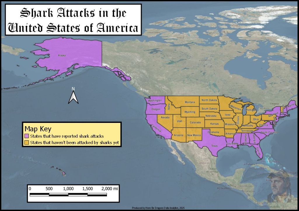
This tongue-in-cheek map is a playful send-up of “serious” GIS and corporate data storytelling. I spent an hour creating a map of shark attacks by state in an obviously absurd way. Then I posted it on LinkedIn, pairing it with a mock consultancy-style caption. It mentioned “leveraging spatial intelligence to power map-based storytelling at scale” in the service of “fine-tuning statewide bite avoidance strategies.” The post went mildly viral. It earned more than 75,000 views and a flood of comments. Reshares further showed how humor and self-awareness can cut through the usual jargon.
I included this project in my portfolio because I care a lot about being fun to work with. I focus not just on being technically strong. I like to bring humor and levity into teams poking fun at buzzwords. I remind people that even very serious work benefits from a bit of play. You can see the original LinkedIn post and discussion here.
